Exploring the Art Institute of Chicago
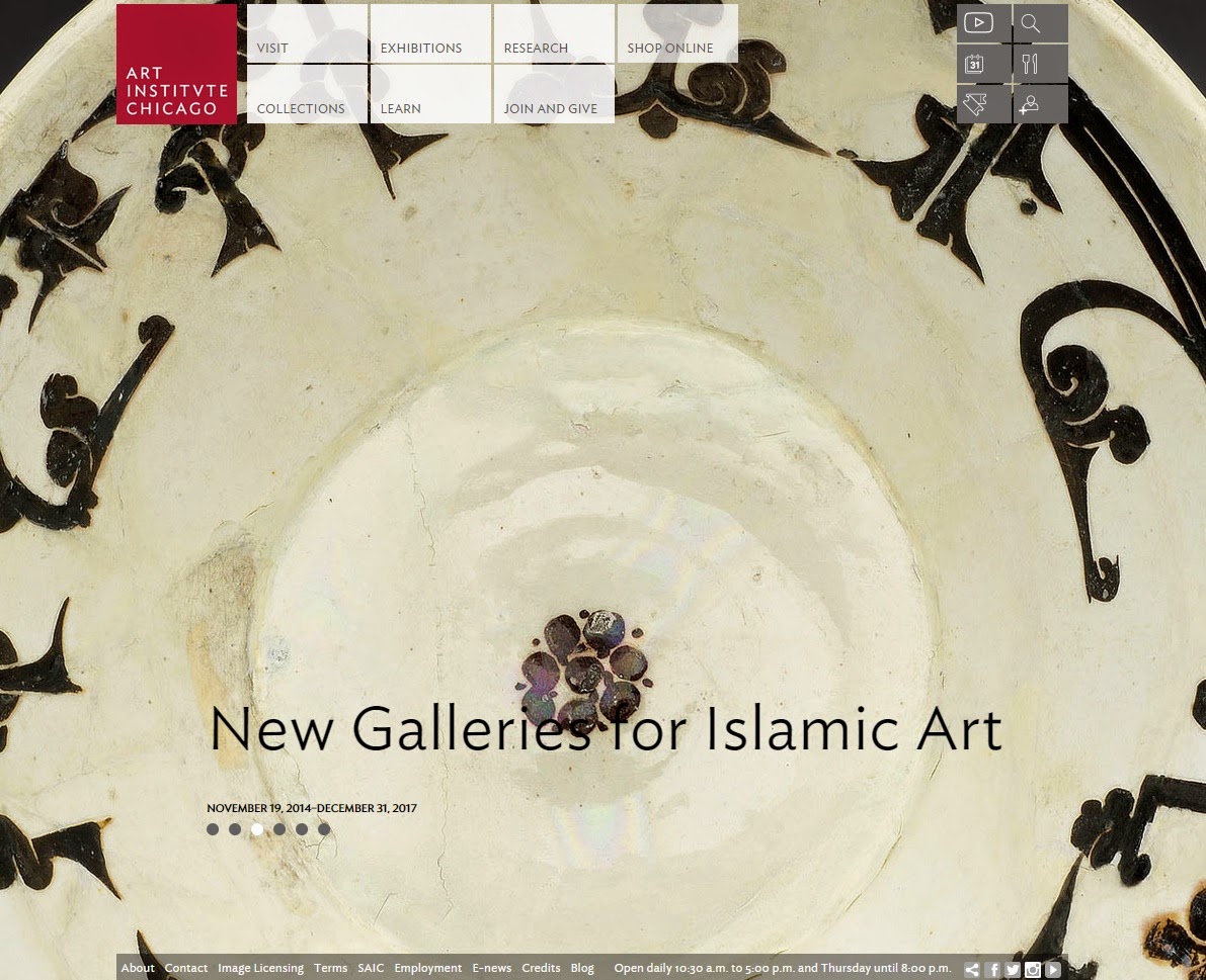
Before exploring the Art Institute of Chicago(AIC) website, I did not expect about it much. I thought it will have no difference from other museum websites. But when I first entered into the website, the slideshows of the current exhibitions and the picture of the museum were used as the whole background of the webpage. And this made it look more interesting and made me read through more about the museum.
Unlike the AIC website, the Louvre Museum website has the picture of the museum from viewing its below as a background. It used black as a main color while the AIC website used red. What I like more in the AIC website than the another is that showing its artworks as a major so that people will get more attracted and fascinated by the artworks it has.
Making up 'My Collections' in the AIC webpage allow us to gather all the artworks that individuals are interested in. And we can even share those via facebook, twitter and e-mail. The most fascinating part is how the numerous artworks are classified in it. Although there is some difficulties like one cannot look through all of them as a slide in a magnified image, every artwork include sufficient information and their details.
↓The Art Institute of Chicago website
 |
↓The Louvre Museum website


No comments:
Post a Comment